

Designs for the printed page.
A thoughtful promotion for Fortune magazine designed in (1957?) by the incredible and witty Leo Lionni. More spreads here.
Lionni interprets each design's intent…
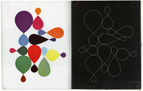
page 4
Variations in size and color on a constant theme (a trademark perhaps?).
page 5 In black space (often more effective than white space) delicate lines weave a strong pattern.
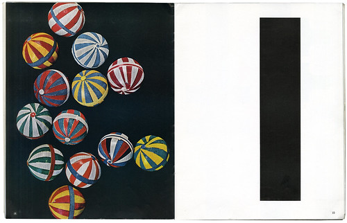
page 14
Photography can have the quality of design if it follows the principles that govern design.
page 15
A half-page sacrifices half of its space to create its own generous margin and to move its center of gravity toward the middle of the page.
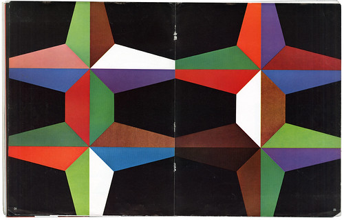
page 24–25
When a design expands from the center to the margins the space seems larger. ariations within repeated symmetries add vitality to the forms.
Make sure to watch: Leo makes a mouse!


